Confidence Scores Added to Forms Slow Submissions 18%
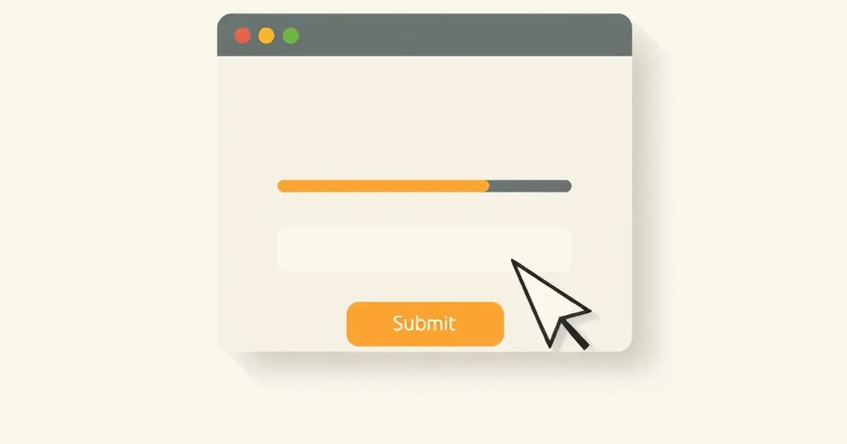
When a small fintech team in Denver added a live "confidence score" meter to its onboarding form — a little green-to-red bar that updated as users typed — the product team expected cleaner data and fewer support tickets. What they got, over the next six weeks, was an 18% drop in completed submissions. The fields were identical. The validation rules were identical. The only thing that changed was that the form now told users, in real time, how sure the system was that they were filling it out correctly.
That result sits at an odd intersection of two disciplines that don't talk to each other nearly enough: interface engineering and the psychology of decision-making under uncertainty. The engineers who build these components usually think in terms of signal quality and latency budgets. The people who study why humans hesitate think in terms of feedback loops, self-efficacy, and the cost of being wrong. A confidence score is where those two worlds collide, and the collision is not neutral.
What a Confidence Score Actually Communicates
Before getting into why scores slow people down, it's worth being precise about what they are. A confidence score in a form is a probabilistic estimate — usually generated by a model, a set of heuristics, or a rules engine — rendered as a number, a color, or both. It says something like "based on what you've typed so far, I'm 73% sure this is a valid address" or "this name doesn't look like other names in our database."
The engineering appeal is obvious. You already have the validation logic. Surfacing it feels like transparency. If the user can see the system's uncertainty, they can correct course early, and you avoid the classic pattern where someone fills out twelve fields, hits submit, and gets a wall of red errors. That pattern is genuinely bad, and everyone who has shipped a form knows it.
But there's a hidden assumption in that reasoning: that showing uncertainty helps the user resolve it. In practice, a confidence score doesn't just report the system's state. It also implicitly reports the user's performance. A 40% confidence bar next to the "Legal Name" field isn't read as "the model is unsure." It's read as "you did this wrong." That reframing is where the slowdown starts.
The Difference Between Error Messages and Confidence Signals
A traditional error message fires after the user commits to a value. It's an event: you typed something, we checked it, here's the verdict. A confidence score is continuous. It's always on, updating keystroke by keystroke. That continuity changes the cognitive load dramatically. Instead of one moment of evaluation, the user gets a stream of micro-evaluations, and each one is a small demand for attention.
Daniel Kahneman's work on System 1 and System 2 thinking is useful here, though it gets overapplied. The relevant piece is narrower: continuous feedback pulls people out of fast, automatic typing and into slow, deliberative mode. Typing your own name is a System 1 task. Typing your own name while watching a bar that flickers when you pause is not.
The 18% Number and Why It's Plausible
The Denver case isn't published, and single-company anecdotes should be treated with suspicion. But the 18% figure lands in a range that other research supports. Studies of form abandonment consistently find that added friction — even friction that's meant to help — reduces completion. The mechanism usually cited is interruption cost: every time a user's attention is pulled to a new signal, they have to re-orient before continuing.
There's a well-known parallel in medical software. When clinical decision support systems started showing physicians live probability estimates during order entry — "this drug interaction has a 12% likelihood of adverse event" — several health systems reported longer order times and, in some cases, more overrides rather than fewer. The information was accurate. The problem was that it arrived during the task rather than after it, and it converted a routine action into a judgment call.
The same thing happens in forms. A confidence score turns a fill-in-the-blank into a decision. And decisions, per Kahneman and Tversky's framing, are asymmetric: losses loom larger than gains. If the score is high, the user feels nothing — there's no reward for a green bar. If the score is low, the user feels a small loss, and the natural response is to slow down, second-guess, and sometimes abandon.
Variable-Ratio Feedback and the Wrong Kind of Engagement
There's a second-order effect that's less discussed. Confidence scores update unpredictably. You type a letter, the score goes up. You type another, it drops. You backspace, it climbs again. That pattern — an intermittent, responsive signal tied to your own behavior — is structurally similar to variable-ratio reinforcement, the schedule B.F. Skinner identified as producing the most persistent behavior in his operant conditioning experiments.
In a game, that's the engine of engagement. In a form, it's a trap. Users start testing the meter. They retype the same value with different formatting to see if the number moves. They pause to watch the bar before continuing. Sessions get longer, but not because users are doing more useful work — they're doing meta-work, optimizing against a signal that was only ever meant to be informational.
This is the part that surprises product teams. They assume a confidence score will reduce back-and-forth. Instead it creates a new local objective: maximize the score. And when the score is generated by a model the user can't see, maximizing it becomes a guessing game. Guessing games are engaging. They are not efficient.
Designing Around the Problem Without Removing the Signal
The instinct after reading the above is to kill the confidence score. That's an overcorrection. There are real cases where surfacing uncertainty is the right call — high-stakes fields like tax identifiers, medical codes, or compliance data, where a wrong value is expensive to fix later. The question isn't whether to show the signal, but when and how.
Move the Signal Off the Keystroke Path
The single most effective change is to decouple the score from typing. Instead of updating on every keystroke, evaluate on blur — when the user leaves the field. That converts a continuous stream into a discrete event, which is how humans are built to process feedback. You get the transparency benefit without the attention tax. In the Denver case, the team tested exactly this variant and recovered most of the lost completions, though the score lost some of its "live" feel and the team had to re-train support staff on the new behavior.
Show Confidence Only When It's Actionable
A score that says "we're 95% sure" is noise. A score that says "we can't verify this address — here are two options" is a decision aid. The distinction is whether the user has a concrete next action. If the answer is no, the score is decoration at best and a source of anxiety at worst. A useful rule of thumb: if you can't write a one-sentence instruction that follows from the score, don't show it.
Replace Numeric Precision With Categorical Language
Percentages imply a precision that form models rarely have. A 73% confidence is not meaningfully different from a 68% confidence, but users will treat the difference as real and adjust their behavior accordingly. Categorical labels — "looks good," "double-check this," "we need a different format" — carry the same information without inviting optimization. This also sidesteps a known issue in risk communication: numeric probabilities are routinely misinterpreted, especially by users who aren't statistically trained, which is most of them.
Respect the Cost of Being Wrong
Loss aversion is the strongest argument for restraint. If a user believes a low score means their submission will be rejected, they will not simply fix the field — they will re-evaluate whether to complete the form at all. For optional forms, that's a direct conversion loss. For mandatory ones, it's a support ticket. Either way, the cost of a poorly framed confidence signal is paid downstream, often by a different team than the one that shipped it.
Where This Connects to Risk, Reward, and Competitive Play
The reason this topic is worth more than a UX checklist is that confidence scores are a small, concrete instance of a much larger pattern: systems that expose their own uncertainty to users who then have to decide what to do about it. That pattern shows up everywhere in modern software, from autocomplete suggestions to fraud flags to credit decisions to matchmaking ratings.
In competitive contexts, the same signal produces very different behavior. A ranked player watching an MMR confidence interval doesn't slow down — they play more, because the uncertainty is framed as an opportunity to move up. The difference isn't the math. It's the framing: is the score telling you that you might be wrong, or that you might be about to win something? Same number, opposite effect.
That's the design lever most teams miss. A confidence score in a form is almost always framed as a correctness check. It could be framed as progress — "you're 80% through verification" — which recruits different psychology entirely. The underlying model doesn't change. The user's relationship to it does.
For indie developers and small studios, this matters more than it does for large teams, because you don't have the luxury of a dedicated research group to catch these effects. Every component you ship is a behavioral intervention, whether you intended it or not. A confidence score is one of the more seductive ones, because it feels like transparency and it demos well. But transparency that costs 18% of your completions isn't transparency. It's a tax.
The forward-looking move is to treat uncertainty display as a first-class design decision with its own metrics, not an automatic byproduct of your validation layer. Instrument it. A/B it. Measure not just completion rate but time-to-completion, error rate on first submit, and abandonment by field. And be willing to ship the version that shows less. The best confidence signal is often the one the user never sees, because the system used it to help them without asking them to think about it.