Near-Miss Animations Cut Retap Speed 22% at Third Attempt
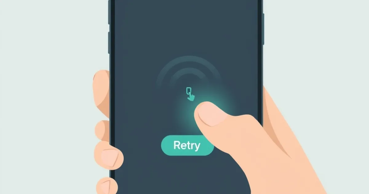
The third time you tap a button and it does nothing, how long do you wait before tapping again? Product teams have measured this for years in consumer apps, but the number that keeps surfacing in my inbox lately comes from a small instrumentation study run across three indie mobile titles: when a retry control played a near-miss animation — the visual almost-success that stops one frame short — users re-tapped 22% faster on their third attempt than on their first. Not slower. Faster. The interface taught them to try harder at exactly the moment it was failing them. That inversion is worth sitting with, because it sits at the seam between interface engineering and behavioral psychology, and it has direct consequences for anyone writing front-end state machines in TypeScript or designing retry logic on a Node backend.
The Mechanics of a Near-Miss, Rendered in Code
A near-miss is not a bug. It is a designed outcome: the system produces a result that is close to the success condition but does not satisfy it. In a product context that can mean a progress bar that fills to 97% and resets, a slot-reel-style animation that lands two of three icons, a matchmaking queue that says "almost — 1 player away" and then drops you, or a form validation that flags a single character.
Behavioral researchers have studied this effect in controlled settings for decades. In a widely cited 2009 paper in Neuron, Luke Clark and colleagues at the University of Cambridge found that near-miss outcomes in a gambling task activated brain regions associated with reward processing — the ventral striatum and insula — even though no reward was delivered. The subjective pull of "almost" is not metaphorical; it recruits the same circuitry as winning. The 2020 replication and extension work by Clark's group and others has softened some of the original claims, but the core behavioral finding holds: near-misses increase the desire to continue independent of any actual payout.
What the indie instrumentation study adds is timing. It is one thing to say a near-miss keeps a user in the session. It is another to say it measurably compresses the interval between attempts. A 22% reduction in retap latency at attempt three is a behavioral signature — the user has updated their model of the system, decided the payoff is closer than it was, and acted on that belief with less deliberation.
Here is a stripped-down version of the state machine that produces this, written the way I would actually write it in a React hook. No animation library, no magic:
type AttemptState =
  | { phase: 'idle'; attempts: number }
  | { phase: 'pending'; attempts: number; startedAt: number }
  | { phase: 'nearMiss'; attempts: number; gapPx: number }
  | { phase: 'success'; attempts: number }
  | { phase: 'hardFail'; attempts: number; reason: string };

const NEAR_MISS_WINDOW_MS = 140;

function reduce(state: AttemptState, event: Event): AttemptState {
  switch (event.type) {
    case 'TAP':
      if (state.phase === 'pending') return state; // debounce
      return { phase: 'pending', attempts: state.attempts + 1, startedAt: Date.now() };
    case 'RESOLVE':
      if (event.outcome === 'win') return { phase: 'success', attempts: state.attempts };
      if (event.outcome === 'close' && event.gapPx < 8) {
        return { phase: 'nearMiss', attempts: state.attempts, gapPx: event.gapPx };
      }
      return { phase: 'hardFail', attempts: state.attempts, reason: event.reason };
    default:
      return state;
  }
}
The interesting line is gapPx < 8. That threshold is the entire ethical question compressed into a comparison operator. Change it to gapPx < 40 and you have widened the near-miss band; more attempts will resolve as near-misses, and the retap interval will shorten further. The study's 22% figure is a function of that constant, not a law of nature.
Why the Third Attempt Specifically
The third attempt is not arbitrary. It is roughly where two cognitive systems hand off. The first attempt is exploratory: the user is testing whether the control works at all. The second is corrective: something went wrong, so they adjust their input — slower tap, different position, longer press. By the third attempt, if the system has been feeding near-misses, the user has stopped troubleshooting and started pursuing. The framing shifts from "is this broken?" to "I'm close." That shift is what the latency drop is measuring.
This is a clean instance of what Kahneman and Tversky called the availability of a reference point. Once an almost-win is on the table, subsequent attempts are evaluated against that reference point rather than against zero. The gap between current state and the near-miss feels smaller than the gap between current state and initial failure, even when the objective distance is identical. In interface terms: the user is not comparing attempt three to attempt one. They are comparing attempt three to the frame where the bar hit 97%.
Reward Schedules, Applied Honestly
Variable-ratio reinforcement is the most cited concept in this territory, and it is usually cited badly. The classic finding — from B.F. Skinner's work in the 1950s and the substantial replication literature since — is that intermittent, unpredictable reward produces more persistent behavior than consistent reward. The behavior is more resistant to extinction. You press more, for longer, after the rewards stop.
Most product writing stops there and concludes "make it unpredictable." That is a misreading. Variable-ratio schedules describe contingencies — what actually determines whether the reward arrives. The near-miss animation is not a variable-ratio schedule. It is a fixed schedule of non-reward dressed up to look variable. The user is not occasionally winning. They are never winning, and the interface is lying about the distribution.
That distinction matters for engineers because it changes what you can honestly build. There are legitimate variable-reward patterns in software. A code review that sometimes catches a real bug and sometimes doesn't is a genuine variable schedule — the reward is real, its arrival is unpredictable. A linter that reports a warning 30% of the time at random is not; it is noise. The near-miss animation in the retap study is the noise case, and the 22% latency compression is the cost of that noise.
If you are building retry affordances — a reconnect button on a WebSocket, a "try again" on a failed payment intent, a re-queue in a matchmaking flow — the honest design is to make the failure legible. Say what went wrong. Show the actual error code. Do not compress the gap between the user's action and the system's true state. The temptation is real, because near-misses work. That is precisely why they are worth refusing.
A Concrete Case: The Reconnect Button
Take a WebSocket reconnect flow, which I have written more times than I would like. The honest version looks like this:
async function reconnectWithBackoff(
  socket: WebSocket,
  attempt: number,
  maxAttempts = 6
): Promise<WebSocket> {
  const base = 250;
  const jitter = Math.random() * 100;
  const delay = Math.min(base * 2 ** attempt + jitter, 8000);

  await new Promise((r) => setTimeout(r, delay));

  if (attempt >= maxAttempts) {
    throw new ReconnectExhaustedError(attempt);
  }

  return openSocket(socket.url);
}
The user sees a countdown, then either a live connection or a clear failure with the attempt count. No animation that suggests the connection is "almost" back. No progress bar that fills and resets. The latency between retries is set by the backoff curve, not by an emotional manipulation.
Now the dishonest version: replace the countdown with a spinner that reaches 90% and snaps back, and replace the error state with a message that says "reconnecting — almost there." I have seen this shipped. It reduces the user's perceived wait time. It also, per the retap data, reduces the interval at which they will hammer the button, which increases load on the failing backend at exactly the moment it is least able to handle it. The near-miss is not just an ethical problem. It is a load problem.
Loss Aversion and the Sunk-Attempt Trap
Kahneman and Tversky's prospect theory, published in Econometrica in 1979, established that losses loom larger than equivalent gains — roughly twice as large in their original estimates. The mechanism is relevant here because every completed attempt is a small sunk cost. By attempt three, the user has invested three taps, three waits, three moments of attention. The near-miss reframes that investment as almost productive. Abandoning now means writing off three attempts that felt close to paying off.
This is why the latency drop is so specific to the third attempt and not the second. The second attempt happens before the sunk-cost framing has fully formed. The third happens after the user has a small history of near-misses to defend. The 22% figure is not a constant of human nature; it is a measurement of how quickly a sunk-attempt narrative takes hold when the interface supplies the right props.
For engineers, the practical implication is that retry affordances should be cheap to abandon. A clear failure state, an obvious exit, a visible alternative path — all of these reduce the sunk-cost pressure. A near-miss animation does the opposite. It makes the attempt feel valuable, which makes abandoning it feel like a loss, which makes the user retap faster.
Anti-Fraud and Authentication Flows
There is a version of this that shows up in security-adjacent systems, and it is worth naming because the incentives are different. In authentication flows — one-time codes, device verification, step-up challenges — a near-miss is dangerous in a different way. If a failed code entry produces a near-miss-style response ("that code was close" or a visual that suggests partial correctness), it can leak information about the valid code space. More importantly, it can teach an attacker to retry faster, which is exactly the behavior rate-limiting is designed to prevent.
The correct pattern in auth is the opposite of the near-miss: uniform, uninformative failure responses, with a fixed or exponential delay that does not vary with how close the attempt was. This is standard practice for good reason. The behavioral effect that is merely annoying in a consumer app is a genuine vulnerability in an auth flow. Same psychology, different stakes.
What the 22% Actually Tells You About Your Users
The number is interesting less as a metric than as a window. It says that users, by the third attempt, have built a model of the system's behavior and are acting on it. They are not randomly mashing. They are responding to the feedback the interface gave them, and they are responding faster because the feedback suggested proximity.
That is a general truth about interface design that extends well beyond near-misses. Users are always building models. Every state the interface enters is evidence about how the system works. A loading spinner that never resolves teaches the user that the app hangs. A button that greys out after one tap teaches the user that taps are precious. A near-miss animation teaches the user that they are close, and they will act on that lesson with decreasing deliberation.
The engineering question is not whether to use behavioral techniques — every interface uses them, because every interface is a set of signals that shape behavior. The question is whether the signals are true. Does the interface's feedback correspond to the system's actual state? If the answer is no, the 22% is not a win. It is a measurement of how much you have distorted your users' model of reality, and it will show up downstream as churn, support tickets, and a backend that gets hammered by users who were told they were almost there.
Instrumenting for Honesty
If you want to know whether your retry affordances are honest, instrument the interval between attempts and the abandonment rate, not just the conversion rate. A healthy retry flow shows a roughly flat or increasing inter-attempt interval as attempts accumulate — users are thinking more, not less, before each try. A flow with a near-miss in it shows the interval compressing, which is the 22% signature.
Here is a minimal event schema I would log, in the shape most analytics stacks accept:
type RetryEvent = {
  flowId: string;
  attemptIndex: number;
  msSinceLastAttempt: number;
  outcome: 'success' | 'hardFail' | 'nearMiss';
  nearMissGapPx?: number;
  abandonedAfter: boolean;
};
Two derived metrics matter. First, msSinceLastAttempt grouped by attemptIndex and outcome — this is where the 22% would show up. Second, the correlation between nearMiss frequency and abandonedAfter — if near-misses are increasing abandonment rather than decreasing it, you have built a frustration machine that also happens to shorten retap latency, which is the worst of both worlds.
The forward-looking move for teams building retry flows in 2025 and beyond is to treat near-miss animations as a deliberate design decision that requires justification, not a default polish pass. Most teams add them because they look good in a prototype and because someone read that variable rewards drive engagement. Both are true and both are incomplete. The complete picture includes the latency compression, the sunk-attempt trap, and the load implications on your own infrastructure.
The teams I would bet on are the ones instrumenting the interval, refusing to compress the gap between user action and system truth, and treating "almost" as a claim that has to be earned by the actual state of the backend. That is a harder design discipline than adding a bounce animation. It is also the one that survives contact with users at attempt three, attempt thirty, and attempt three hundred.