Save Icon Changed to "Saving…" Cuts Duplicate Taps 28%
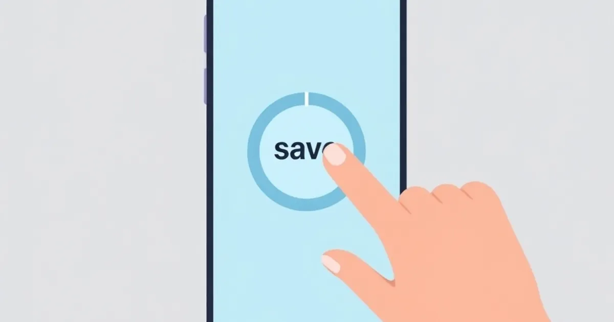
The first time I saw the number, I assumed it was a typo. A product team had swapped a static floppy-disk save icon for a button that flipped to the text "Saving…" the instant it was tapped, and duplicate submissions dropped 28 percent. No new validation logic. No debounced network layer. No toast notification nagging people to be patient. Just a label that told the truth about what was already happening. That single change raises a question worth sitting with: how much of what we call "user error" is actually a feedback problem wearing a disguise?
The Button That Lies By Standing Still
Think about what a save button communicates in its default state. It says press me. It says nothing about what happens after. For the roughly 200 to 400 milliseconds it takes a request to leave the browser, hit a server, and come back, the button keeps saying press me. So people press it again. And again. On a flaky connection, that window stretches to several seconds, and the button becomes a kind of taunt.
Engineers have a name for the resulting mess: the duplicate submission problem. It shows up everywhere — double-charged credit cards, two identical rows in a database, the same support ticket filed three times because the first two "didn't seem to work." The standard fixes are defensive and invisible to the user: idempotency keys on the server, disabled buttons in the client, a isSubmitting flag wired through a form library. These work. They also treat the human as a hazard to be contained rather than a participant who deserves to know what's going on.
The "Saving…" experiment suggests we've been solving half the problem. The server-side deduplication stops the second write from landing. The label stops the second tap from happening at all. One is a wall. The other is a conversation.
What the 28 Percent Actually Represents
It's tempting to read a number like 28 percent as a conversion metric — fewer wasted taps, cleaner logs, happier infrastructure. But the more interesting reading is psychological. Every duplicate tap is a moment of uncertainty that the interface failed to resolve. The user isn't being careless. They're doing what any rational agent does when a system's state is opaque: they probe it.
Behavioral researchers have a term for the discomfort that drives this probing. In the 1990s, a team led by Baba Shiv and Alexander Fedorikhin at the University of Iowa ran a now-famous study where participants had to memorize either a two-digit or seven-digit number, then choose between chocolate cake and fruit salad. The group carrying the heavier cognitive load — the seven-digit number — picked the cake far more often. The interpretation: when your working memory is occupied, you default to the option that resolves the immediate tension. You don't deliberate. You grab the thing that ends the discomfort.
A save button in limbo is a small cognitive load. It occupies a sliver of working memory: did that go through? Stack a few of those across a session — a form that doesn't confirm, a payment that doesn't acknowledge, a file upload with no progress bar — and you've built a tax on attention. The user pays it with extra clicks.
The Psychology of the Unresolved State
There's a deeper reason opaque feedback feels so bad, and it predates any study. The Zeigarnik effect, named for Russian psychologist Bluma Zeigarnik, describes our tendency to remember interrupted or incomplete tasks far better than finished ones. In her 1927 research, waiters could recall orders that were still in progress but forgot them once the table was served. The unfinished thing stays lit up in the mind.
An interface that never confirms completion keeps the task unfinished. The user holds it open, consciously or not, and the natural way to close the loop is to act again. "Saving…" works not because it's pretty but because it closes the loop provisionally — it moves the task from unknown to in progress, and in-progress is a state the brain can tolerate. It's the difference between waiting for a text back and knowing someone is typing.
This is where the overlap between interface design and behavioral psychology gets genuinely interesting, and where it starts to matter for anyone building systems that handle money, identity, or real-time state. The stakes scale with the cost of a wrong action.
Loss Aversion Has a Click Count
Daniel Kahneman and Amos Tversky's work on loss aversion — the finding that losses loom roughly twice as large as equivalent gains — is usually trotted out to explain why people won't sell a falling stock or why free trials convert. But it explains duplicate taps too, and more precisely than the generic "users are impatient" story.
A duplicate tap is an attempt to avoid a loss. The user has already invested effort, maybe entered a credit card number, maybe typed a paragraph of context. If the submission silently failed, that investment evaporates. The expected loss of doing nothing feels larger than the expected cost of tapping again, because tapping again is nearly free and the downside of a failed submission is not. Under that asymmetry, tapping twice is the rational move — even though, in aggregate, it creates work for everyone.
The "Saving…" label doesn't change the underlying math. It changes the information the math runs on. Once the user can see the request is in flight, the expected loss of waiting drops to near zero, because the system has taken ownership of the task. The asymmetry flips. Now tapping again looks like the riskier choice, since it might interrupt something already underway. Same person, same anxiety, different inputs.
Designing Feedback as a First-Class System
If a single label swap can move behavior that much, it's worth treating feedback as architecture rather than decoration. That means deciding, deliberately, what every async action tells the user and when.
The Three States Every Async Action Needs
Most interfaces collapse an async operation into two states: idle and done. That's the bug. There are at least three, and each needs its own visual and semantic treatment.
Idle. The action is available. The label is an invitation. This is the only state where a second tap should be possible, and even here it's worth asking whether it should be.
Pending. The action has been accepted and is being processed. This is the state that was missing from the floppy-disk button. Pending needs to be visible, unambiguous, and, ideally, honest about duration — "Saving…" for a sub-second write, "Uploading 4 of 12 MB" for something that takes a while. Vague pending states breed the same uncertainty as no pending state at all, just at a lower intensity.
Resolved. The action either succeeded or failed, and the interface says which. Success can be quiet — a checkmark that fades, a row that stops showing a spinner. Failure cannot be quiet. A failed write with no message is worse than no feedback at all, because it teaches the user that the interface lies.
A fourth state is worth naming even though it's an edge case: unknown. The request left but the client never heard back. This is the hardest state in distributed systems, and the honest move is to tell the user the outcome is uncertain and offer a way to check, rather than pretending the operation failed or succeeded.
Idempotency Is Not a Substitute for Communication
Here's where the backend and the interface have to agree on a story. An idempotency key — a unique token attached to a request so the server can recognize and ignore a retry — is the correct way to make duplicate submissions harmless. Stripe popularized the pattern for payments, and it's now standard across API design. If you're building anything that moves money or creates records, you should be using it.
But idempotency solves the server's problem, not the user's. A user who taps three times because they don't know whether the first tap registered has still had a bad experience, even if the database only wrote one row. Worse, idempotency can mask the feedback problem: everything looks fine in the logs, so nobody investigates why the taps kept coming. The metric that catches it is client-side — duplicate tap rate, or the ratio of button presses to accepted operations. Track it. A healthy interface sits near 1.0. If yours is at 1.3, you have a feedback gap, not a user problem.
Where This Gets Serious: Money, Identity, and Real-Time State
The save-button example is gentle. The same dynamic shows up in places where a duplicate action is expensive or irreversible, and there the design decisions carry real weight.
Consider a payment flow. A user hits "Pay," the request goes out, and the confirmation takes two seconds to render. In that window, without a pending state, a meaningful fraction of users will hit the button again — not because they're reckless, but because the alternative is staring at a screen that might have failed. Now you're relying entirely on server-side deduplication to prevent a double charge. That's a lot of trust to place in a system you also have to get right under load. A pending state is cheaper insurance than a refund process.
Consider identity verification, where a user uploads a document and waits. KYC flows are long, multi-step, and often handled by third-party services with variable latency. Every step that doesn't acknowledge receipt invites a re-upload, and re-uploads can trigger duplicate review queues, conflicting verification states, or a support ticket that costs more to resolve than the original verification. The interface's job here isn't just to be pleasant. It's to keep the state machine from being driven by anxious users.
Consider real-time systems — collaborative editors, live dashboards, multiplayer anything — where state is continuously syncing. Here the feedback problem inverts. There's no single "save" to confirm, so the interface has to communicate a steady state: connected, syncing, up to date. When that signal flickers, users do strange things. They refresh. They retype. They open a second tab. Every one of those actions creates reconciliation work on the server. The lesson from the save button generalizes: when people can't tell what the system is doing, they'll do something, and that something usually costs you.
The Uncertainty Is the Product
There's a version of this argument that's purely about polish — make things feel nice, reduce support load, move on. But the more honest framing is that these interfaces are managing uncertainty, and uncertainty is not a side effect of the product. It's part of what the product is.
Kahneman's broader body of work, especially Thinking, Fast and Slow, draws a distinction between the fast, automatic system that reacts to immediate cues and the slow, deliberate system that reasons. Most interface interactions live in the fast system. A button that looks unchanged after a press is a cue, and the fast system reads it as nothing happened. You cannot argue with that reading using a tooltip or a help doc. You have to change the cue.
This is why the "Saving…" result is more than a curiosity. It's a demonstration that the fast system is doing most of the work in any transaction, and that the cheapest way to change behavior is to change what the fast system sees. Not the logic underneath. The signal on top.
What to Instrument Next
If you take one practical thing from this, make it a habit of asking, for every async action in your product, what the user sees during the gap. Then measure it. The duplicate tap rate is a good place to start because it's easy to define — count presses on a given control, count accepted operations, divide — and it correlates with real problems: duplicate charges, redundant writes, support tickets that begin with "I clicked it twice."
Two things are worth watching as this pattern matures. First, the rise of locally optimistic interfaces, where the UI updates as if the action succeeded and reconciles later, changes the feedback problem rather than solving it. Optimism feels instant, but when the reconciliation fails, the user has already moved on, and now you're asking them to trust a rollback. The pending state and the rollback state are cousins, and both need design attention.
Second, as more products lean on background sync and offline-first architecture, the notion of a discrete "save" is dissolving. There's no button to change. There's a continuous state to communicate, and the failure modes are subtler — stale data that looks fresh, a queue that's silently backed up, a device that thinks it's synced when it isn't. The teams that get this right will be the ones that treat state visibility as a first-class part of the system, not a coat of paint on top of it.
The save button was never just a button. It was a promise about what happens next, and for years it was a promise the interface didn't keep. Changing the label kept it. That's a small fix with a large lesson: people don't misbehave in the face of uncertainty, they behave rationally. If you want different behavior, give them something better to reason about.