What Happens When the Undo Button Lives 5 Seconds Too Long
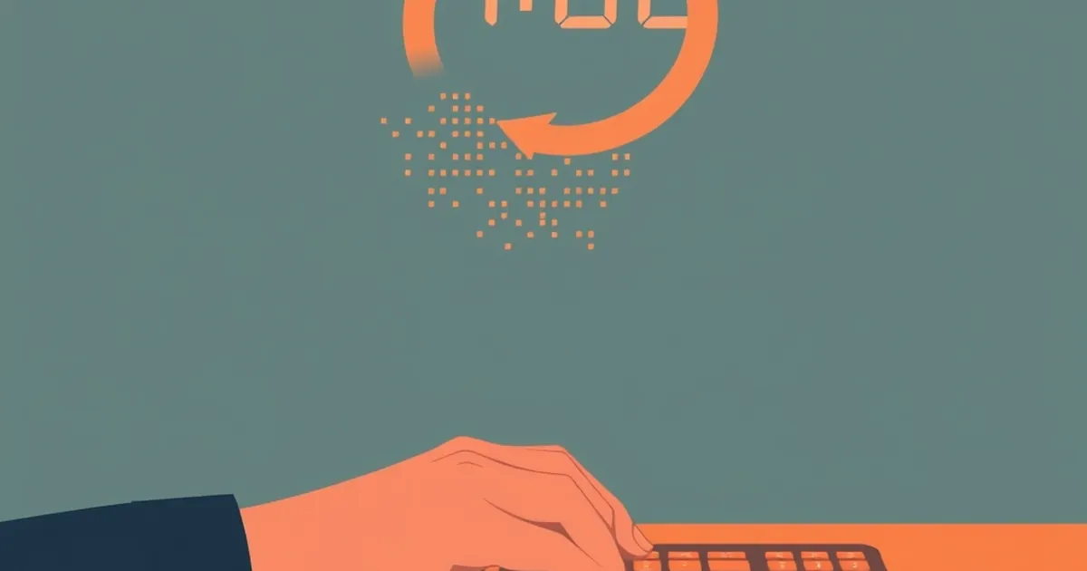
Every interface designer eventually faces the same small, uncomfortable question: how long should an undo window stay open? Five seconds feels generous. Ten feels sloppy. One feels punishing. But what looks like a UI detail turns out to be a decision about human psychology — about regret, reversibility, and the stories people tell themselves after they've already committed. The length of the undo window quietly shapes how users behave before they click anything at all.
This piece isn't about any particular product. It's about what happens to human decision-making when software holds the door open a few seconds longer than it needs to — and what that tells us about building interfaces for people who are, reliably, not perfectly rational.
The psychology of a window that stays open
The most useful frame here comes from work that predates the web by decades. In 2002, Daniel Kahneman won the Nobel Memorial Prize in Economic Sciences largely for demonstrating that people weigh losses more heavily than equivalent gains — a pattern now called loss aversion. In a classic illustration, most people reject a 50/50 bet to win $150 or lose $100, even though the expected value is positive. The pain of the loss outweighs the pleasure of the win.
Undo windows sit directly on top of that asymmetry. When a user clicks "delete," they've mentally handed over the loss. The undo window is a brief reprieve where the loss hasn't fully registered yet. Extend that window, and you change the moment at which the emotional accounting happens. Shorten it, and the accounting snaps shut.
There's a second concept that matters just as much: reversibility. Research on decision-making consistently finds that people behave more cautiously, and often more deliberately, when they believe a choice can be undone. But there's a twist — and it's the twist that makes this interesting for anyone building software.
The paradox of the safety net
When people know they can reverse a decision, they tend to act faster and with less deliberation. That's not necessarily bad; it's how you get through a day of a hundred small choices. But it creates a strange outcome: the longer and more visible the undo window, the less attention users may pay at the moment of the click. The safety net changes the behavior of the person jumping.
This is where the "5 seconds too long" question gets real. If your undo window is so prominent that it becomes a part of the decision itself — if users are clicking "delete" because they know they can undo — then you've moved the moment of truth. The decision isn't made at the click anymore. It's deferred. And deferred decisions have a way of piling up.
Variable rewards and the shape of a click
Behavioral psychology's most famous contribution to interface design is the variable-ratio schedule of reinforcement, first described by B.F. Skinner in the 1950s. Skinner found that organisms rewarded on an unpredictable schedule — sometimes after one action, sometimes after ten — press the lever more persistently than those rewarded every time. The unpredictability itself becomes the engine.
Most discussions of variable rewards in software focus on notifications, feeds, and progress mechanics. But there's a quieter version hiding inside the undo window. Consider what happens when an undo is sometimes available and sometimes not — when the window has expired, when the action was irreversible, when the system silently accepted the change.
Users learn the shape of that availability. They learn which actions have a cushion and which don't. And they adjust their behavior accordingly — not consciously, but through the same reinforcement pathway Skinner described. Actions with a cushion get taken more casually. Actions without one get a second look.
Here's the concrete example that makes it tangible. In 2018, a team of researchers studying digital form-filling behavior (published in CHI, the ACM Conference on Human Factors in Computing Systems) found that participants who were told their inputs could be edited after submission completed forms significantly faster but made more errors on the first pass — errors that required more total correction time than the slower, more careful group. The safety net didn't just change the speed; it changed the quality of attention at the moment of input.
The lesson isn't "remove the undo button." It's that the undo button is not neutral. It's a behavioral lever, and every lever has a length.
What "5 seconds too long" actually looks like
Imagine a settings panel where deleting a saved payment method triggers a toast that says "Removed — Undo" and lingers for twelve seconds. Most users will never notice the difference between twelve and five. But a subset will. The ones who click "delete" casually, planning to undo if they change their mind, now have a longer runway to change their mind — and a longer runway to forget they were ever going to. The toast disappears. The card is gone. The user blames the software.
That's the failure mode: not that the undo window is too generous, but that its generosity invites a decision the user wasn't fully committed to. The window becomes a place to park a maybe. And parked maybes have a way of becoming regrets.
Designing for the moment after the click
The practical question for anyone building interfaces is not "how long should undo last?" It's "what kind of decision am I asking the user to make, and where do I want their attention to live?"
There are roughly three shapes of destructive action, and each wants a different treatment.
The trivial reversible action. Archiving an email. Marking a task complete. These want a short, quiet undo — two to five seconds, visually understated. The goal is to catch the accidental click without inviting a reconsideration. If the user genuinely meant it, the window should get out of the way.
The consequential reversible action. Deleting a document, removing a team member, canceling a subscription. These want a longer window — but not a louder one. The window should be visible enough to be found, quiet enough not to become a decision point in itself. Ten seconds is often right here, but the toast should not be the primary confirmation. The confirmation should happen before the click, not after.
The irreversible action. Permanently deleting an account, transferring funds, publishing publicly. These should not rely on an undo window at all. They should rely on a deliberate, friction-full confirmation — typing a word, re-entering a password, waiting through a cooldown. The undo window is the wrong tool here, and stretching it to cover an irreversible action is a category error.
The mistake many teams make is treating the undo window as a universal safety valve. It isn't. It's a specific tool for a specific class of mistake — the slip, not the decision.
The cooldown pattern and what it borrows from behavioral econ
A related pattern worth studying is the cooldown: a deliberate delay between the request and the execution of a consequential action. Some financial apps use it for large transfers. Some social platforms use it for account deletion. The cooldown borrows directly from the loss-aversion literature — it gives the user a window in which the anticipated loss can register before the loss becomes real.
The cooldown is not an undo window, but it shares the same psychology. It works because it respects the asymmetry Kahneman described: people need time to feel a loss before they commit to it, and the feeling doesn't arrive instantly. A five-second cooldown is usually too short to register. A twenty-four-hour cooldown is often too long to be humane. The sweet spot depends on the size of the loss.
For software teams, the practical takeaway is that the timing of reversibility is a design decision with behavioral consequences, not a technical default. The default in most UI libraries is a toast that lives for a fixed number of seconds. That default was chosen for visual consistency, not for decision quality. It's worth overriding.
The compounding cost of a deferred decision
There's a systems-level argument here that gets less attention than the individual one. When undo windows are generous and visible, users defer more decisions. Deferred decisions accumulate. A user who deletes twelve things in a session, planning to undo half of them, is holding twelve open loops in working memory. Cognitive load research — going back to John Sweller's work on cognitive load theory in the 1980s — consistently shows that open loops degrade performance on subsequent tasks. The undo window isn't free. It borrows attention from whatever comes next.
This is why the "5 seconds too long" framing matters. It's not that five extra seconds cause harm in isolation. It's that five extra seconds, multiplied across a session and across a user base, change the texture of how people work with the software. They make the software feel less like a tool and more like a negotiation.
The best interfaces I've seen treat undo as a courtesy, not a contract. It's there if you need it. It doesn't announce itself. It doesn't invite you to be sloppy. And when it expires, it expires quietly — no scolding, no modal, no "are you sure?" after the fact. The user made a choice; the software honored it; the window closed.
Where this goes next
The forward-looking version of this problem is that undo windows are about to get much more sophisticated — and much more tempting to over-engineer. With client-side state management now capable of holding full action histories, and with local-first architectures making it cheap to keep every mutation reversible, the technical ceiling on undo is disappearing. The constraint is no longer "can we reverse this?" It's "should we, and for how long, and with how much fanfare?"
My prediction is that the teams who get this right will be the ones who treat the undo window as a behavioral surface, not a visual one. They'll instrument it. They'll measure how often users click "undo" versus how often they let the window expire versus how often they take a destructive action they later regret through a support ticket. They'll discover, probably, that the optimal window is shorter than they assumed and quieter than they built.
And they'll discover something else, too: the users who trust the software most are not the ones who rely on undo. They're the ones who've learned, through consistent experience, that the software won't punish them for a slip — and won't flatter them into one, either. That's a harder thing to build than a toast. It's also the thing that makes an interface feel like it was made by someone who was paying attention.
The undo button is a small feature with a long shadow. Five seconds is not a technical detail. It's a statement about how much you trust your users to know their own minds — and how much you're willing to let them change them.